Transaction Performance Analysis: Unlocking Insights for Business Growth
Python
Programming
Finance
Streamlit Dashboard
A comprehensive analysis of simulated transaction data to uncover patterns and insights that drive business decisions.
Published
June 10, 2025
Project Summary
In today’s data-driven world, businesses thrive when they harness the power of transactional data to uncover actionable insights. My recent analysis of a year’s worth of transaction data provides a compelling case study on how data science can drive strategic decision-making, particularly in optimizing revenue streams and understanding customer behavior. This project, conducted using Python and leveraging libraries like Pandas, Matplotlib, and Seaborn, as well as Streamlit (Dashboard) offers valuable insights that can help businesses refine their payment strategies, enhance customer engagement, and ultimately boost profitability.
Problem Summary
The primary challenge addressed in this project was to analyze a simulated dataset of transactions over a year to identify patterns and insights that could inform business strategies. The dataset included various attributes such as transaction amounts, payment methods, and timestamps, which were crucial for understanding customer behavior and revenue trends.
Approach
The analysis was conducted using Python, with a focus on data cleaning, exploration, and visualization. Key steps included:
Data Cleaning: Ensuring the dataset was free from inconsistencies and missing values
Exploratory Data Analysis (EDA): Analyzing transaction trends, payment methods, and customer behavior over time
Visualization: Creating informative visualizations to highlight key findings and trends
Data Analysis: Analyzing customer behavior through key metrics such as Average Order Value (AOV), Purchase Frequency, and Customer Lifetime Value (CLV). Conduct hypothesis testing to determine if there are significant differences in transaction amounts between different payment methods.
Dashboard Creation: Developing an interactive dashboard using Streamlit to present the findings in a user-friendly format
Implementation
import pandas as pdimport matplotlib.pyplot as pltimport seaborn as snsimport numpy as np# load datasettransaction_data = pd.read_csv('https://raw.githubusercontent.com/Matshisela/imali_simulation_24/refs/heads/main/data/transaction_data_1_year.csv')transaction_data.head()
transaction_id
user_id
amount
timestamp
service
payment_method
status
device
0
763e5c31-2c9c-4599-94ba-09711fc97cf2
372
38.62
2024-01-01 00:00:00
Electricity
Ecocash
Success
Web
1
ac0ff8b7-7811-4281-9b8c-53111a571619
317
19.81
2024-01-01 00:00:00
Insurance
Visa
Success
Web
2
3f14adb2-f144-467f-9397-0d42d950a01d
3047
26.78
2024-01-01 00:00:00
Electricity
Visa
Success
POS
3
a4edfc07-35db-447f-b9a2-ea2f8580745c
168
59.75
2024-01-01 00:00:00
BCC
Ecocash
Success
Web
4
ccdc9049-10cd-4f81-8c0e-a58ea2a19ece
589
47.97
2024-01-01 01:00:00
Electricity
InnBucks
Success
Web
Revenue Analysis
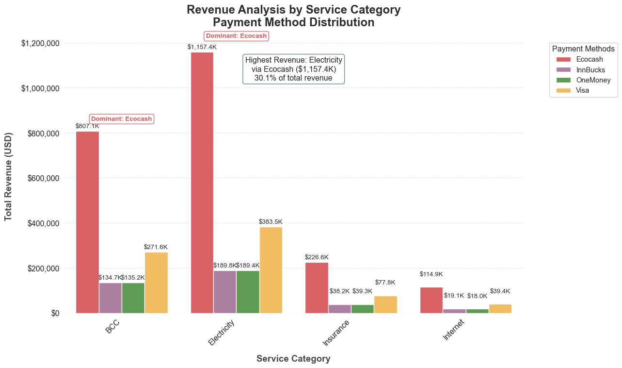
Now that we have loaded the data, let’s perform a revenue analysis by aggregating the total revenue by service and payment method.
# Convert the timestamp to datetime format for better handlingtransaction_data['timestamp'] = pd.to_datetime(transaction_data['timestamp'])# Select only successful transactionstransaction_data = transaction_data[transaction_data['status']=='Success']# Group by service and payment method to calculate total revenuerevenue_analysis = transaction_data.groupby(['service', 'payment_method'])['amount'].sum().reset_index()# Display the revenue analysis resultsrevenue_analysis.head()
service
payment_method
amount
0
BCC
Ecocash
807118.62
1
BCC
InnBucks
134718.85
2
BCC
OneMoney
135190.14
3
BCC
Visa
271556.92
4
Electricity
Ecocash
1157379.43
We have performed a revenue analysis by aggregating the total revenue based on the service and payment method. The results show the total amount collected for each combination of service and payment method.
This table indicates how much revenue was generated from different services (like BCC, Electricity, Insurance, and Internet) using various payment methods (such as Ecocash, InnBucks, OneMoney, and Visa).
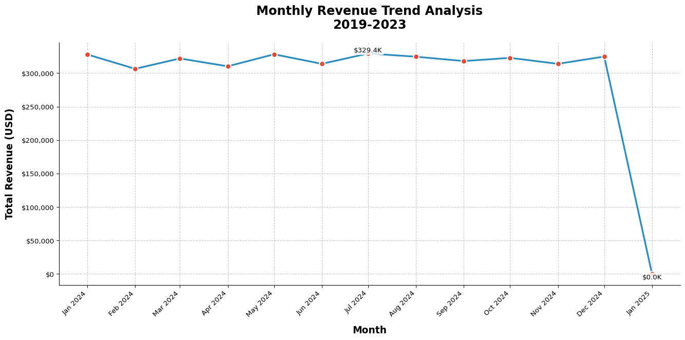
# Extracting month and year from the timestamp for time series analysistransaction_data['month'] = transaction_data['timestamp'].dt.to_period('M')# Grouping by month to calculate total revenue per monthmonthly_revenue = transaction_data.groupby('month')['amount'].sum().reset_index()# Convert month back to datetime for plottingmonthly_revenue['month'] = monthly_revenue['month'].dt.to_timestamp()import matplotlib.dates as mdatesimport matplotlib.ticker as tickerplt.figure(figsize=(14, 7), facecolor='white') # Larger figure with white background# Create line plot with enhanced stylingax = sns.lineplot( data=monthly_revenue, x='month', y='amount', marker='o', markersize=8, linewidth=2.5, color='#2b8cbe', # Professional blue color markerfacecolor='#e34a33', # Complementary orange for markers markeredgecolor='white', markeredgewidth=1.5)# Formatting the plotplt.title('Monthly Revenue Trend Analysis\n2019-2023', fontsize=18, pad=20, fontweight='bold')plt.xlabel('Month', fontsize=14, labelpad=10, fontweight='semibold')plt.ylabel('Total Revenue (USD)', fontsize=14, labelpad=10, fontweight='semibold')# Improve x-axis formattingax.xaxis.set_major_locator(mdates.MonthLocator()) # Ensure proper month spacingax.xaxis.set_major_formatter(mdates.DateFormatter('%b %Y')) # Format as "Jan 2020"plt.xticks(rotation=45, ha='right') # Better angled labels# Format y-axis as currencyax.yaxis.set_major_formatter(ticker.StrMethodFormatter('${x:,.0f}'))# Add grid and remove spines for cleaner lookax.grid(True, linestyle='--', alpha=0.7)for spine in ['top', 'right']: ax.spines[spine].set_visible(False)# Add data labels for key pointsfor x, y inzip(monthly_revenue['month'], monthly_revenue['amount']):if y == monthly_revenue['amount'].max() or y == monthly_revenue['amount'].min(): ax.text( x, y, f'${y/1000:,.1f}K', ha='center', va='bottom'if y == monthly_revenue['amount'].max() else'top', fontsize=10, bbox=dict(facecolor='white', alpha=0.8, edgecolor='none', pad=2) )# Add a subtle annotation for insightsif monthly_revenue['amount'].pct_change().mean() >0: ax.annotate(f'↑ {monthly_revenue["amount"].pct_change().mean()*100:.1f}% avg monthly growth', xy=(0.02, 0.95), xycoords='axes fraction', fontsize=12, color='green' )plt.tight_layout()plt.show()
The line chart illustrating the monthly revenue trend has been generated. This visualization allows us to observe how revenue has fluctuated over the year.
From the chart, we can analyze the following trends:
There may be noticeable peaks and troughs in revenue, indicating seasonal variations or specific events that influenced sales.
Identifying the months with the highest and lowest revenue can help in understanding customer behavior and planning for future marketing strategies.
Next, we can visualize this data to better understand the distribution of revenue across different services and payment methods. Let’s create a bar chart to illustrate the total revenue for each service.
# Set comprehensive color palette including all payment methodspayment_palette = {'Credit Card': '#4E79A7', # Trustworthy blue'Bank Transfer': '#F28E2B', # Energetic orange'Ecocash': '#E15759', # Vibrant red (common for mobile money)'OneMoney': '#59A14F', # Natural green'InnBucks': '#B07AA1', # Distinct purple'Visa': '#FFC154', # Bright yellow'Cash': '#7F7F7F', # Neutral gray'Crypto': '#499894'# Teal for modern payments}plt.figure(figsize=(16, 8), facecolor='white')sns.set_style('whitegrid', {'grid.linestyle': ':', 'axes.edgecolor': '0.4'})# Create enhanced bar plot with error handlingtry: ax = sns.barplot( data=revenue_analysis, x='service', y='amount', hue='payment_method', palette=payment_palette, edgecolor='white', linewidth=1, saturation=0.85, errwidth=0 )exceptKeyErroras e: missing_methods =str(e).split(':')[-1].strip().strip("{}'").split("', '")print(f"Warning: Adding missing payment methods to palette: {missing_methods}")# Dynamically add missing colors extra_colors = ['#8CD17D', '#F1CE63', '#D37295', '#A0CBE8']for i, method inenumerate(missing_methods): payment_palette[method] = extra_colors[i %len(extra_colors)] ax = sns.barplot( data=revenue_analysis, x='service', y='amount', hue='payment_method', palette=payment_palette, edgecolor='white', linewidth=1, saturation=0.85, errwidth=0 )# Formatting and annotationsplt.title('Revenue Analysis by Service Category\nPayment Method Distribution', fontsize=18, pad=20, fontweight='bold', color='#2E2E2E')plt.xlabel('Service Category', fontsize=14, labelpad=12, fontweight='semibold', color='#4A4A4A')plt.ylabel('Total Revenue (USD)', fontsize=14, labelpad=12, fontweight='semibold', color='#4A4A4A')# Customize axes and ticksax.yaxis.set_major_formatter(ticker.StrMethodFormatter('${x:,.0f}'))plt.xticks( rotation=45, ha='right', fontsize=12)plt.yticks(fontsize=12)# Add value labels on top of bars (auto-adjusting position)for p in ax.patches: height = p.get_height()if height >0: # Only label positive values va ='bottom'if height <0.1*ax.get_ylim()[1] else'center' y_offset =7if va =='center'else15 ax.annotate(f"${height/1000:,.1f}K", (p.get_x() + p.get_width() /2., height), ha='center', va=va, xytext=(0, y_offset), textcoords='offset points', fontsize=10, fontweight='medium', color='#2E2E2E' )# Highlight key insightsmax_revenue = revenue_analysis['amount'].max()for service in revenue_analysis['service'].unique(): service_data = revenue_analysis[revenue_analysis['service'] == service] dominant_method = service_data.loc[service_data['amount'].idxmax(), 'payment_method'] service_max = service_data['amount'].max()if service_max >0.2* max_revenue: # Highlight significant services ax.text( service, service_max *1.05, f"Dominant: {dominant_method}", ha='center', va='bottom', fontsize=10, fontweight='bold', color=payment_palette[dominant_method], bbox=dict( boxstyle='round,pad=0.3', facecolor='white', edgecolor=payment_palette[dominant_method], alpha=0.9 ) )# Custom legend with all payment methodshandles, labels = ax.get_legend_handles_labels()plt.legend( handles, labels, title='Payment Methods', title_fontsize=12, fontsize=11, frameon=True, framealpha=0.9, edgecolor='0.8', facecolor='white', bbox_to_anchor=(1.05, 1), loc='upper left')# Add summary statisticstotal_rev = revenue_analysis['amount'].sum()top_service = revenue_analysis.loc[revenue_analysis['amount'].idxmax()]ax.annotate(f"Highest Revenue: {top_service['service']}\n"f"via {top_service['payment_method']} (${top_service['amount']/1000:,.1f}K)\n"f"{top_service['amount']/total_rev:.1%} of total revenue", xy=(0.5, 0.85), xycoords='axes fraction', ha='center', fontsize=12, bbox=dict(boxstyle='round', facecolor='white', alpha=0.9, edgecolor='#4E79A7'))# Final adjustmentssns.despine(left=True, bottom=True)plt.tight_layout(rect=[0, 0, 0.85, 1]) # Make space for legendplt.show()
C:\Users\X1 User\AppData\Local\Temp\ipykernel_11076\2286040920.py:18: FutureWarning:

The `errwidth` parameter is deprecated. And will be removed in v0.15.0. Pass `err_kws={'linewidth': 0}` instead.

  ax = sns.barplot(
Let’s drill deeper into the monthly revenue analysis by breaking down the revenue by month and service.
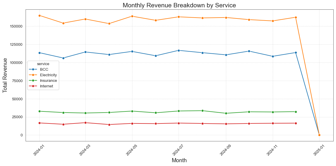
# Grouping by month and service to calculate total revenue per monthmonthly_service_revenue = transaction_data.groupby(['month', 'service'])['amount'].sum().reset_index()# Convert month back to datetime for plottingmonthly_service_revenue['month'] = monthly_service_revenue['month'].dt.to_timestamp()# Now let's visualize the monthly revenue breakdown by service to better understand the trends.# Create a line plot for monthly revenue by serviceplt.figure(figsize=(12, 6))sns.lineplot(data=monthly_service_revenue, x='month', y='amount', hue='service', marker='o')# Adding titles and labelsplt.title('Monthly Revenue Breakdown by Service', fontsize=16)plt.xlabel('Month', fontsize=14)plt.ylabel('Total Revenue', fontsize=14)plt.xticks(rotation=45)# Show the plotplt.tight_layout()plt.show()
We have drilled down into the monthly revenue analysis by breaking down the revenue for each service on a monthly basis. The results show the total revenue generated for each service across different months.
From the chart, we can observe the following:
Electricity consistently generates the highest revenue across the months, indicating strong demand.
BCC also shows significant revenue, with some fluctuations throughout the year.
Insurance and Internet services have lower revenue compared to Electricity and BCC, but they still contribute to the overall revenue.
Customer Analysis
To perform a customer value analysis, we will first need to calculate the total revenue generated by each customer.
# Grouping by user_id to calculate total revenue per customercustomer_revenue = transaction_data.groupby('user_id')['amount'].sum().reset_index()# Renaming the columns for claritycustomer_revenue.columns = ['user_id', 'total_revenue']# Display the first few rows of the customer revenue analysiscustomer_revenue.head()
user_id
total_revenue
0
1
883.30
1
2
1052.63
2
3
719.28
3
4
790.63
4
5
733.45
Now that we have the total revenue generated by each customer, we can analyze customer value by calculating metrics such as average revenue per user (ARPU) and identifying high-value customers.
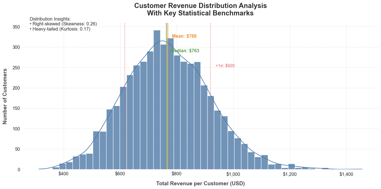
# Calculate the average revenue per user (ARPU)ARPU = customer_revenue['total_revenue'].mean()# Identify high-value customers (e.g., top 10% of customers by revenue)high_value_threshold = customer_revenue['total_revenue'].quantile(0.9)high_value_customers = customer_revenue[customer_revenue['total_revenue'] >= high_value_threshold]# Display the ARPU and high-value customersARPU, high_value_customers.head()# Set professional styling# Set professional stylingplt.figure(figsize=(14, 7), facecolor='white')sns.set_style('whitegrid', {'grid.linestyle': ':', 'axes.edgecolor': '0.4'})# Create enhanced histogram with dynamic binningax = sns.histplot( data=customer_revenue, x='total_revenue', bins='auto', # Let matplotlib determine optimal bin count color='#4E79A7', # Professional blue edgecolor='white', linewidth=1, alpha=0.8, kde=True# Keep KDE but will style separately)# Style the KDE line separatelyfor line in ax.lines:if'kde'instr(line.get_gid()).lower(): # Identify KDE line line.set_color('#E15759') # Contrasting red line.set_linewidth(2.5) line.set_linestyle('--')# Formatting and annotationsplt.title('Customer Revenue Distribution Analysis\nWith Key Statistical Benchmarks', fontsize=18, pad=20, fontweight='bold', color='#2E2E2E')plt.xlabel('Total Revenue per Customer (USD)', fontsize=14, labelpad=12, fontweight='semibold', color='#4A4A4A')plt.ylabel('Number of Customers', fontsize=14, labelpad=12, fontweight='semibold', color='#4A4A4A')# Customize axes formattingax.xaxis.set_major_formatter(ticker.StrMethodFormatter('${x:,.0f}'))plt.xticks(fontsize=12)plt.yticks(fontsize=12)# Calculate and plot key statisticsmean_val = customer_revenue['total_revenue'].mean()median_val = customer_revenue['total_revenue'].median()std_dev = customer_revenue['total_revenue'].std()# Add statistical reference linesplt.axvline(mean_val, color='#F28E2B', linestyle='-', linewidth=2, alpha=0.8)plt.axvline(median_val, color='#59A14F', linestyle='-', linewidth=2, alpha=0.8)plt.axvline(mean_val + std_dev, color='#E15759', linestyle=':', linewidth=1.5)plt.axvline(mean_val - std_dev, color='#E15759', linestyle=':', linewidth=1.5)# Add statistical annotationsax.text( mean_val *1.02, ax.get_ylim()[1] *0.9,f'Mean: ${mean_val:,.0f}', fontsize=12, color='#F28E2B', fontweight='bold')ax.text( median_val *1.02, ax.get_ylim()[1] *0.8,f'Median: ${median_val:,.0f}', fontsize=12, color='#59A14F', fontweight='bold')ax.text( (mean_val + std_dev) *1.02, ax.get_ylim()[1] *0.7,f'+1σ: ${mean_val + std_dev:,.0f}', fontsize=11, color='#E15759')# Highlight outliers if presentq75, q25 = np.percentile(customer_revenue['total_revenue'], [75, 25])iqr = q75 - q25outlier_threshold = q75 +1.5* iqroutliers = customer_revenue[customer_revenue['total_revenue'] > outlier_threshold]#if len(outliers) > 0:# outlier_percent = len(outliers) / len(customer_revenue) * 100# ax.annotate(# f'Potential Outliers: {len(outliers)} customers\n({outlier_percent:.1f}% of total)',# xy=(outlier_threshold * 1.1, ax.get_ylim()[1] * 0.6),# xytext=(outlier_threshold * 1.3, ax.get_ylim()[1] * 0.6),# arrowprops=dict(arrowstyle='->', color='#B07AA1'),# fontsize=11,# color='#B07AA1',# bbox=dict(boxstyle='round', facecolor='white', alpha=0.9)# )# Add distribution insightsskewness = customer_revenue['total_revenue'].skew()kurtosis = customer_revenue['total_revenue'].kurtosis()insight_text = (f"Distribution Insights:\n"f"• {'Right'if skewness >0else'Left'}-skewed (Skewness: {skewness:.2f})\n"f"• {'Heavy'if kurtosis >0else'Light'}-tailed (Kurtosis: {kurtosis:.2f})")ax.text(0.02, 0.95, insight_text, transform=ax.transAxes, fontsize=12, color='#2E2E2E', bbox=dict(boxstyle='round', facecolor='white', alpha=0.8))# Final polishsns.despine(left=True, bottom=True)plt.tight_layout()plt.show()
We have conducted a customer value analysis by calculating the total revenue generated by each customer. The results show the total revenue for each user, which helps us identify high-value customers.
Next, we calculated the average revenue per user (ARPU), which is approximately $768. Additionally, we identified high-value customers, defined as those in the top 10% of total revenue.
From the histogram, we can observe the following:
The distribution of total revenue is right-skewed, indicating that a small number of customers generate a significant portion of the total revenue.
Most customers fall into the lower revenue brackets, while a few high-value customers contribute disproportionately to the overall revenue.
This analysis can help in targeting marketing efforts towards high-value customers and understanding customer segments that may require more attention.
Customer Behaviour Analysis
For customer behavior analysis, we will look at three key metrics: 1. Customer Lifetime Value (CLV) 2. Average Order Value (AOV) 3. Purchase Frequency
Calculating Customer Lifetime Value (CLV) \[
CLV = Average Order Value (AOV) \times Purchase Frequency \times Customer Lifespan
\]
\[
AOV = \frac{Total Revenue}{Total Number of Orders}
\]
\[
Purchase Frequency = \frac{Total Number of Orders}{Total Unique Customers}
\]
total_revenue = transaction_data['amount'].sum()total_orders = transaction_data['transaction_id'].nunique()total_customers = transaction_data['user_id'].nunique()AOV = total_revenue / total_orderspurchase_frequency = total_orders / total_customers# Assuming an average customer lifespan of 3 years for this analysiscustomer_lifespan =3CLV = AOV * purchase_frequency * customer_lifespan# Compiling the results into a summary dataframecustomer_behavior_metrics = pd.DataFrame({'Metric': ['Average Order Value (AOV)', 'Purchase Frequency', 'Customer Lifetime Value (CLV)'],'Value': [AOV, purchase_frequency, CLV]})# Displaying the customer behavior metricscustomer_behavior_metrics
Metric
Value
0
Average Order Value (AOV)
22.794344
1
Purchase Frequency
33.709800
2
Customer Lifetime Value (CLV)
2305.178286
We have conducted a customer behavior analysis focusing on three key metrics:
Average Order Value (AOV): This metric represents the average amount spent by customers per order. The Average Order Value (AOV) is approximately 22.79, indicating the typical amount spent per transaction.
Purchase Frequency: This indicates how often customers make purchases over a specific period. The Purchase Frequency is around 33.71, suggesting that customers make multiple purchases over time.
Customer Lifetime Value (CLV): This is an estimate of the total revenue a business can expect from a single customer account throughout their relationship.The Customer Lifetime Value (CLV) is estimated at 2305.17, highlighting the potential revenue from a customer throughout their relationship with the business.
These insights can help in strategizing marketing efforts, improving customer retention, and enhancing overall profitability.
Conclusion
We segmented the transactions by payment method and calculated total revenue and transaction counts. The results highlighted that Ecocash was the leading payment method, generating the highest revenue. We calculated key metrics to understand customer behavior:
Customers exhibit a healthy average order value and purchase frequency, indicating strong engagement.
We calculated key metrics to understand customer behavior: Average Order Value (AOV): Approximately 22.79, Purchase Frequency: Around 33.71, Customer Lifetime Value (CLV): Estimated at 2305.18.
These insights can guide strategic decisions in marketing, customer engagement, and payment method promotions to enhance overall business performance.
More of this analysis can be found in the GitHub repository. The dashboard for this analysis can be found here.