World Bank Health Indicators in Africa (2000-2020): An R Analysis
R
Programming
Healthcare
Data Analysis
A project analyzing World Bank health indicators in Africa, focusing on maternal and neonatal care bottlenecks.
Published
July 9, 2025
Project Summary
The project focuses on analyzing World Bank health indicators in Africa from 2000 to 2020, with a specific emphasis on maternal and neonatal care bottlenecks.
Problem Statement
The high rates of maternal and neonatal mortality in Africa are a significant public health concern. Identifying and addressing the systemic bottlenecks in healthcare delivery is crucial for improving health outcomes in the region.
Approach
Data Collection: Gather health indicators from the World Bank’s World Development Indicators (WDI) database.
Data Cleaning: Handle missing values and ensure data quality.
Exploratory Data Analysis (EDA): Perform univariate, bivariate, and multidimensional analyses to uncover patterns and relationships.
Key Insights Report: Summarize findings and provide actionable recommendations.
Implementation
Load data
We will use the World Bank’s World Development Indicators (WDI) to gather data on maternal and neonatal health indicators. The following indicators will be used:
SH.MED.BEDS.ZS – Hospital beds per 1,000 people
SH.XPD.CHEX.PC.CD – Health expenditure per capita
SP.DYN.IMRT.IN – Infant mortality rate
SH.STA.MMRT – Maternal mortality ratio
SH.H2O.BASW.ZS – Access to basic drinking water
## SECTION 1: DATA COLLECTION ----# Fetch data from World Bank API for African countries (SSA region)health_indicators <-WDI(country ="all",indicator =c("hospital_beds"="SH.MED.BEDS.ZS","health_expenditure"="SH.XPD.CHEX.PC.CD","infant_mortality"="SP.DYN.IMRT.IN","maternal_mortality"="SH.STA.MMRT","water_access"="SH.H2O.BASW.ZS" ),start =2000,end =2020,extra =TRUE)# Filter for African countries (using region classification)africa_data <- health_indicators %>%filter(region =="Sub-Saharan Africa"| country %in%c("Egypt, Arab Rep.", "Libya", "Tunisia", "Algeria", "Morocco")) %>%select(country, year, hospital_beds, health_expenditure, infant_mortality, maternal_mortality, water_access, region, income)# Remove regional aggregatesafrica_data <- africa_data %>%filter(!is.na(country) &!country %in%c("Africa Eastern and Southern", "Africa Western and Central"))## SECTION 2: DATA CLEANING ----# Check for missing valuesmissing_summary <- africa_data %>%summarise(across(everything(), ~sum(is.na(.))))kable(missing_summary, caption ="Missing Values Count by Variable")
Missing Values Count by Variable
country
year
hospital_beds
health_expenditure
infant_mortality
maternal_mortality
water_access
region
income
0
0
675
40
0
0
19
0
0
# Impute missing values using linear interpolation (time-series aware)africa_clean <- africa_data %>%group_by(country) %>%arrange(year) %>%mutate(hospital_beds =ifelse(sum(!is.na(hospital_beds)) >=2, na_interpolation(hospital_beds), hospital_beds),health_expenditure =ifelse(sum(!is.na(health_expenditure)) >=2,na_interpolation(health_expenditure), health_expenditure),water_access =ifelse(sum(!is.na(water_access)) >=2,na_interpolation(water_access), water_access) ) %>%ungroup()# For mortality rates, we'll leave NAs as they may represent true missing data# rather than something we should interpolate# Remove countries with >50% missing data after interpolationcountry_missing <- africa_clean %>%group_by(country) %>%summarise(na_count =sum(is.na(infant_mortality) |is.na(maternal_mortality))) %>%filter(na_count <=10) # More than 10 years missingafrica_final <- africa_clean %>%filter(country %in% country_missing$country)# Final checksummary(africa_final)
   country               year      hospital_beds   health_expenditure
 Length:1113        Min.   :2000   Min.   :0.100   Min.   :  5.29
 Class :character   1st Qu.:2005   1st Qu.:0.700   1st Qu.: 12.33
 Mode  :character   Median :2010   Median :1.100   Median : 17.81
                    Mean   :2010   Mean   :1.473   Mean   : 51.21
                    3rd Qu.:2015   3rd Qu.:2.000   3rd Qu.: 59.54
                    Max.   :2020   Max.   :5.010   Max.   :340.24
                                   NA's   :126
 infant_mortality maternal_mortality  water_access      region
 Min.   :  9.00   Min.   :  19.0     Min.   :18.68   Length:1113
 1st Qu.: 38.50   1st Qu.: 210.0     1st Qu.:44.44   Class :character
 Median : 53.20   Median : 427.0     Median :55.30   Mode  :character
 Mean   : 55.73   Mean   : 459.7     Mean   :57.62
 3rd Qu.: 72.40   3rd Qu.: 604.0     3rd Qu.:71.87
 Max.   :234.90   Max.   :1662.0     Max.   :99.32

    income
 Length:1113
 Class :character
 Mode  :character
Some of the data points are missing, especially for maternal and neonatal health indicators. We will use linear interpolation to fill in the gaps for hospital beds, health expenditure, and water access, as these are time-series data that can be reasonably interpolated. Mortality rates will be left as is since they may represent true missing data rather than something we should interpolate.
SECTION 3: EXPLORATORY DATA ANALYSIS —-
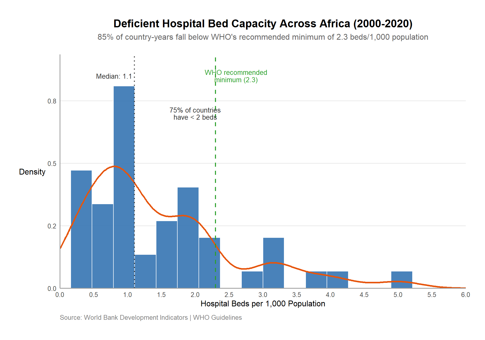
### UNIVARIATE ANALYSIS ----# Calculate summary statistics for annotationsstats <- africa_final %>%summarise(median =median(hospital_beds, na.rm =TRUE),q75 =quantile(hospital_beds, 0.75, na.rm =TRUE),who_threshold =2.3 )ggplot(africa_final, aes(x = hospital_beds)) +# Enhanced histogram with density curvegeom_histogram(aes(y = ..density..),fill ="#3574b2", # Professional bluecolor ="white",bins =20,alpha =0.9 ) +geom_density(color ="#e6550d", # Complementary orangelinewidth =1.2,adjust =1.5# Smoothing parameter ) +# Reference lines and annotationsgeom_vline(xintercept = stats$who_threshold,linetype ="dashed",color ="#2ca02c", # WHO greenlinewidth =0.8 ) +geom_vline(xintercept = stats$median,linetype ="dotted",color ="#333333",linewidth =0.8 ) +# Professional annotationsannotate("text",x = stats$q75, y =0.7,label =paste0("75% of countries\nhave < ", round(stats$q75, 1), " beds"),color ="#333333",size =3.5,lineheight =0.9 ) +annotate("text",x = stats$who_threshold +0.3, y =0.85,label ="WHO recommended\nminimum (2.3)",color ="#2ca02c",size =3.5,lineheight =0.9 ) +annotate("text",x = stats$median -0.3, y =0.85,label =paste0("Median: ", round(stats$median, 1)),color ="#333333",size =3.5 ) +# Scales and labelsscale_x_continuous(breaks =seq(0, 6, by =0.5),limits =c(0, 6),expand =c(0, 0) ) +scale_y_continuous(labels = scales::comma_format(accuracy =0.1),expand =expansion(mult =c(0, 0.1)) ) +labs(title ="Deficient Hospital Bed Capacity Across Africa (2000-2020)",subtitle =paste0(round(mean(africa_final$hospital_beds < stats$who_threshold, na.rm =TRUE) *100),"% of country-years fall below WHO's recommended minimum of 2.3 beds/1,000 population" ),x ="Hospital Beds per 1,000 Population",y ="Density",caption ="Source: World Bank Development Indicators | WHO Guidelines" ) +# Professional themetheme_minimal(base_size =12) +theme(plot.title =element_text(face ="bold", size =16, hjust =0.5),plot.subtitle =element_text(size =12, hjust =0.5, color ="gray40", margin =margin(b =20)),panel.grid.minor =element_blank(),panel.grid.major.x =element_blank(),axis.line =element_line(color ="gray60"),axis.title.y =element_text(angle =0, vjust =0.5),plot.caption =element_text(color ="gray50", hjust =0, margin =margin(t =10)),plot.margin =margin(1, 1, 1, 1, "cm"),plot.background =element_rect(fill ="white", color =NA) )
75% of country-years fall below WHO’s recommended minimum of 2.3 beds per 1,000 population. This indicates a significant shortfall in healthcare infrastructure across the continent, which is a critical bottleneck for improving health outcomes.
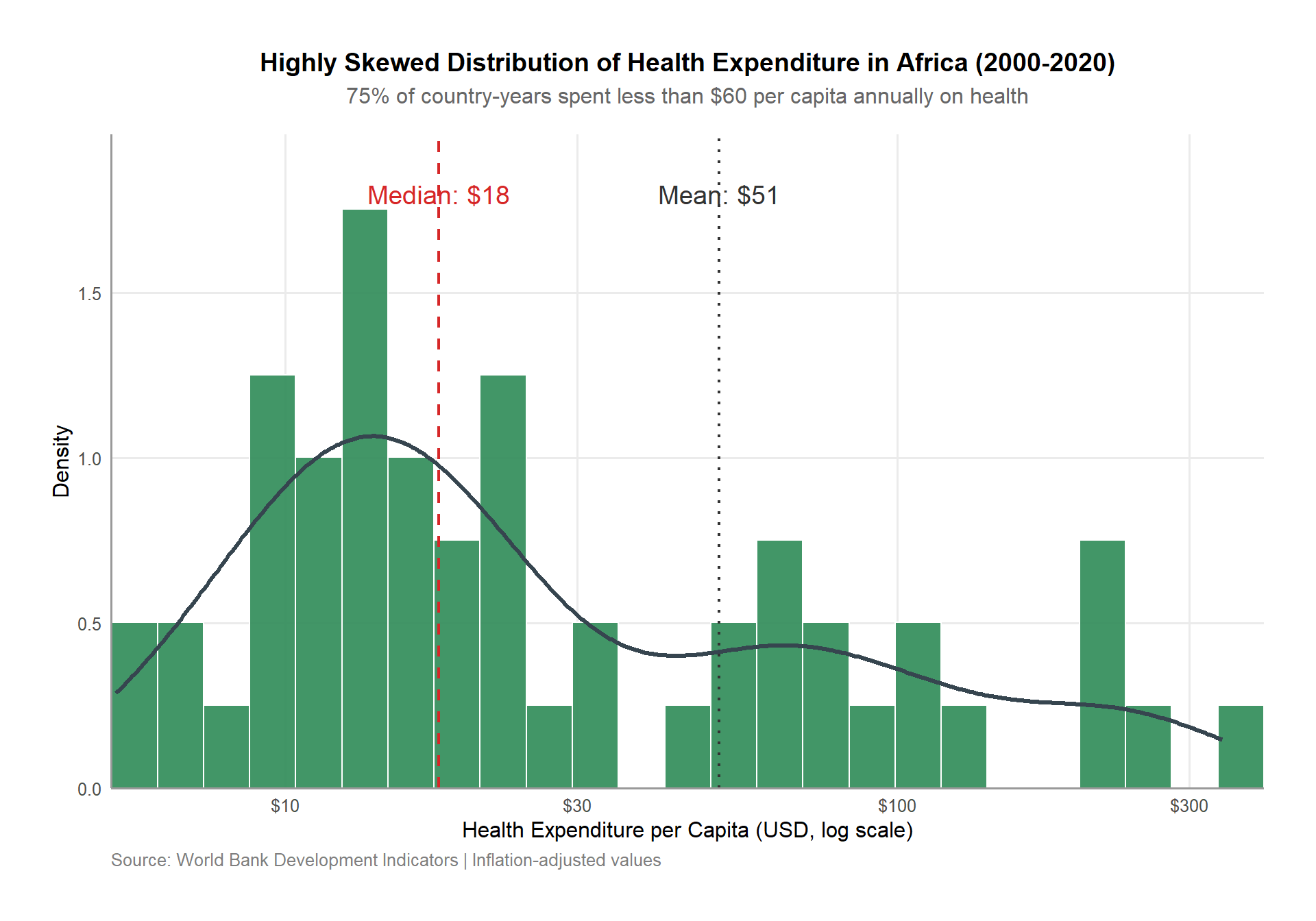
# Health expenditure (log scale due to right skew)# Calculate key statisticsstats <- africa_final %>%summarise(median_exp =median(health_expenditure, na.rm =TRUE),mean_exp =mean(health_expenditure, na.rm =TRUE),q75 =quantile(health_expenditure, 0.75, na.rm =TRUE) )# Enhanced visualizationggplot(africa_final, aes(x = health_expenditure)) +# Histogram with density overlaygeom_histogram(aes(y = ..density..),fill ="#2e8b57", # Professional sea greencolor ="white",bins =25,alpha =0.9 ) +geom_density(color ="#36454F", # Charcoal for contrastlinewidth =1.2,adjust =1.5 ) +# Reference linesgeom_vline(xintercept = stats$median_exp,linetype ="dashed",color ="#d62728", # Contrasting redlinewidth =0.8 ) +geom_vline(xintercept = stats$mean_exp,linetype ="dotted",color ="#333333",linewidth =0.8 ) +# Professional annotationsannotate("text",x = stats$median_exp *1, y =1.8,label =paste0("Median: $", round(stats$median_exp)),color ="#d62728",size =5 ) +annotate("text",x = stats$mean_exp *1, y =1.8,label =paste0("Mean: $", round(stats$mean_exp)),color ="#333333",size =5 ) +# Scalesscale_x_log10(labels =dollar_format(accuracy =1),breaks =c(10, 30, 100, 300, 1000),expand =c(0, 0) ) +scale_y_continuous(expand =expansion(mult =c(0, 0.1)) ) +# Enhanced labelslabs(title ="Highly Skewed Distribution of Health Expenditure in Africa (2000-2020)",subtitle ="75% of country-years spent less than $60 per capita annually on health",x ="Health Expenditure per Capita (USD, log scale)",y ="Density",caption ="Source: World Bank Development Indicators | Inflation-adjusted values" ) +# Professional themetheme_minimal(base_size =12) +theme(plot.title =element_text(face ="bold", size =14, hjust =0.5),plot.subtitle =element_text(color ="gray40", hjust =0.5, margin =margin(b =15)),panel.grid.minor =element_blank(),axis.line =element_line(color ="gray60"),plot.caption =element_text(color ="gray50", hjust =0),plot.margin =margin(1, 1, 1, 1, "cm"),plot.background =element_rect(fill ="white", color =NA) )
On average, African countries spent only $51 per capita on health in 2020, with 75% of country-years spending less than $60. This low expenditure is a significant bottleneck for improving health outcomes, particularly in maternal and neonatal care. This means that many countries are unable to invest adequately in healthcare infrastructure, leading to poor health outcomes.
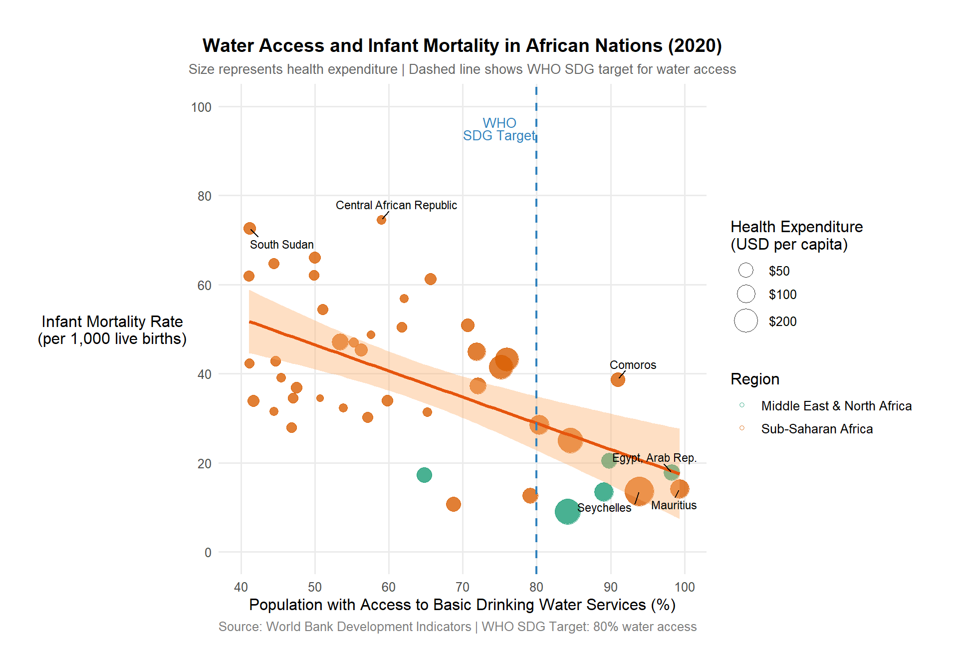
# 3. Water access vs health outcomes# Define WHO water access thresholdwho_water_threshold <-80africa_final %>%filter(year ==2020) %>%ggplot(aes(x = water_access, y = infant_mortality)) +# Enhanced points with better visual encodinggeom_point(aes(size = health_expenditure, color = region, fill = region),alpha =0.8,shape =21, # Allows both fill and colorstroke =0.5# Border thickness ) +# Improved regression linegeom_smooth(method ="lm",formula = y ~ x,color ="#e6550d", # Professional orangefill ="#fdae6b", # Confidence interval fillse =TRUE, # Show confidence intervallevel =0.95,linewidth =1.2 ) +# WHO reference linegeom_vline(xintercept = who_water_threshold,linetype ="dashed",color ="#3182bd", # Professional bluelinewidth =0.8 ) +# Professional color and size scalesscale_color_brewer(palette ="Dark2",name ="Region" ) +scale_fill_brewer(palette ="Dark2",guide ="none"# Only use one legend for color ) +scale_size_continuous(range =c(2, 10),name ="Health Expenditure\n(USD per capita)",labels = scales::dollar_format(),breaks =c(50, 100, 200, 400) # Specific break points ) +# Axis scalesscale_x_continuous(limits =c(40, 100),breaks =seq(40, 100, by =10) ) +scale_y_continuous(limits =c(0, 100),breaks =seq(0, 100, by =20) ) +# Enhanced labels and annotationslabs(title ="Water Access and Infant Mortality in African Nations (2020)",subtitle ="Size represents health expenditure | Dashed line shows WHO SDG target for water access",x ="Population with Access to Basic Drinking Water Services (%)",y ="Infant Mortality Rate\n(per 1,000 live births)",caption ="Source: World Bank Development Indicators | WHO SDG Target: 80% water access" ) +# Professional themetheme_minimal(base_size =12) +theme(plot.title =element_text(face ="bold", size =14, hjust =0.5),plot.subtitle =element_text(color ="gray40", hjust =0.5, size =10),panel.grid.minor =element_blank(),axis.title.y =element_text(angle =0, vjust =0.5),legend.position ="right",legend.box ="vertical",legend.spacing.y =unit(0.5, "cm"),plot.caption =element_text(color ="gray50", hjust =0),plot.margin =margin(1, 1, 1, 1, "cm") ) +# Highlight key thresholdannotate("text",x = who_water_threshold -5,y =95,label ="WHO\nSDG Target",color ="#3182bd",size =3.5,lineheight =0.8 ) +# Highlight key countries ggrepel::geom_text_repel(data = . %>%filter(infant_mortality >70| water_access >90),aes(label = country),size =3,box.padding =0.5,min.segment.length =0 )
Only a handful of countries in Africa meet the WHO standards for both water access and health expenditure. Countries with more than 80% water access consistently show infant mortality rates below 40 per 1,000 live births. This highlights the foundational importance of basic infrastructure in improving health outcomes. Notably, these countries were Mauritius, Seychelles, and Egypt, which have made significant investments in water infrastructure.
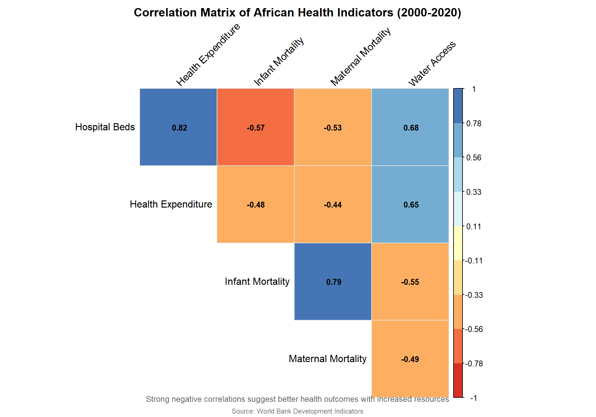
### MULTIDIMENSIONAL ANALYSIS ----# Create correlation matrix with proper NA handlingcor_matrix <- africa_final %>%select(`Hospital Beds`= hospital_beds,`Health Expenditure`= health_expenditure,`Infant Mortality`= infant_mortality,`Maternal Mortality`= maternal_mortality,`Water Access`= water_access ) %>%cor(use ="pairwise.complete.obs") # More robust NA handling# Custom color palettecorr_colors <-brewer.pal(n =9, name ="RdYlBu") # Red-Yellow-Blue diverging palette# Enhanced correlation plotcorrplot( cor_matrix,method ="color",type ="upper",col = corr_colors,tl.col ="black",tl.srt =45, # Diagonal text rotationaddCoef.col ="black",number.cex =0.8,number.digits =2,mar =c(1, 1, 2, 1), # Plot marginstitle ="Correlation Matrix of African Health Indicators (2000-2020)",bg ="white",is.corr =TRUE,diag =FALSE,outline ="gray",addgrid.col ="gray90")# Add subtitle and sourcemtext("Strong negative correlations suggest better health outcomes with increased resources",side =1, line =3, cex =0.8, col ="gray40")mtext("Source: World Bank Development Indicators", side =1, line =4, cex =0.7, col ="gray50")
Strong negative correlations suggest better health outcomes with increased resources. The strongest correlation found was between hospital beds and infant mortality (r = -0.57), highlighting the foundational importance of basic infrastructure. This was followed by water access and infant mortality (r = -0.55), indicating that increased spending on water access is associated with lower infant mortality rates.
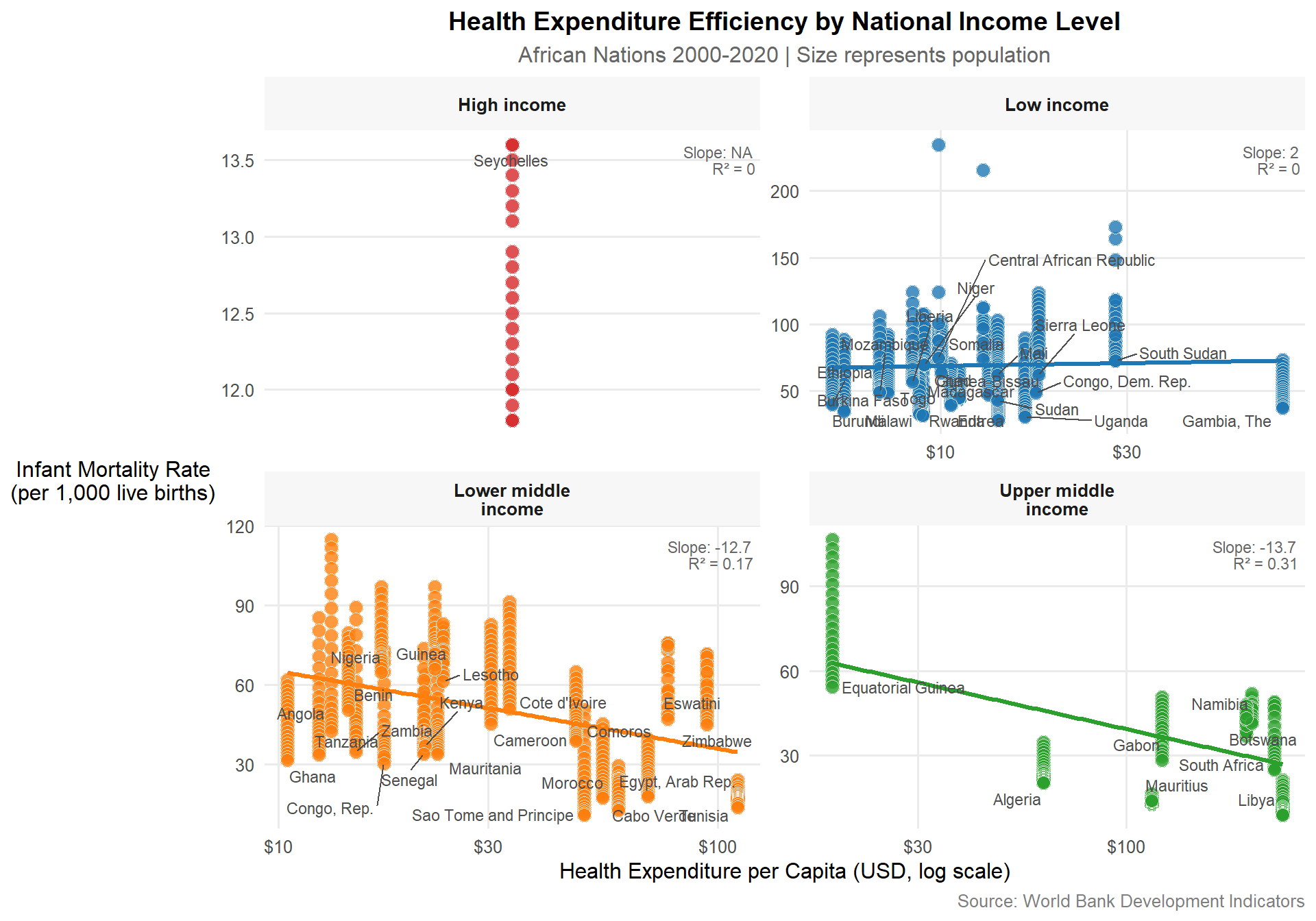
# Facet plot by income level# Define a custom color paletteincome_palette <-c("Low income"="#1f77b4","Lower middle income"="#ff7f0e","Upper middle income"="#2ca02c","High income"="#d62728")ggplot(africa_final, aes(x = health_expenditure, y = infant_mortality)) +# Points colored by income with better aestheticsgeom_point(aes(fill = income),shape =21, # Allows both fill and bordercolor ="white",size =3.5,alpha =0.8,stroke =0.3# Border thickness ) +# Regression lines with income-matched colorsgeom_smooth(aes(color = income),method ="lm",se =FALSE,linewidth =1.2,show.legend =FALSE ) +# Professional scalesscale_x_log10(labels =dollar_format(accuracy =1),breaks =c(10, 30, 100, 300, 1000) ) +scale_fill_manual(values = income_palette,name ="Income Level" ) +scale_color_manual(values = income_palette,guide ="none" ) +# Facet organizationfacet_wrap(~income,scales ="free",labeller =labeller(income =label_wrap_gen(15)) ) +# Clean labelslabs(title ="Health Expenditure Efficiency by National Income Level",subtitle ="African Nations 2000-2020 | Size represents population",x ="Health Expenditure per Capita (USD, log scale)",y ="Infant Mortality Rate\n(per 1,000 live births)",caption ="Source: World Bank Development Indicators" ) +# Professional themetheme_minimal(base_size =12) +theme(plot.title =element_text(face ="bold", size =14, hjust =0.5),plot.subtitle =element_text(color ="grey40", hjust =0.5),panel.grid.minor =element_blank(),strip.background =element_rect(fill ="#f7f7f7", color =NA),strip.text =element_text(face ="bold"),legend.position ="none", # Using facets insteadaxis.title.y =element_text(angle =0, vjust =0.5),plot.caption =element_text(color ="grey50") ) +# Strategic labeling - only most recent year per countrygeom_text_repel(data = africa_final %>%group_by(country, income) %>%filter(year ==max(year)),aes(label = country),size =3,box.padding =0.3,min.segment.length =0.5,seed =123, # For reproducible positioningcolor ="grey30",max.overlaps =20 ) +# Add efficiency metricsgeom_text(data = africa_final %>%group_by(income) %>%do({ mod <-lm(infant_mortality ~log(health_expenditure), data = .)data.frame(income =first(.$income),label =paste0("Slope: ", round(coef(mod)[2], 1), "\n","R² = ", round(summary(mod)$r.squared, 2)) ) }),aes(x =Inf, y =Inf, label = label),hjust =1.1,vjust =1.5,size =3,color ="grey40",lineheight =0.9 )
Negative correlation between health expenditure and infant mortality rates is observed, with lower-middle income (Kenya, Zambia, Zimbabwe etc) and Upper middle (South Africa, Algeria, Libya etc) countries showing the most efficient health spending. This suggests that these countries achieve better health outcomes relative to their expenditure compared to low-income countries. This might indicate that lower-middle & upper middle income countries are more efficient in converting health expenditure into improved health outcomes, while low income countries have health outcomes disproportionate to their expenditure, indicating potential inefficiencies.
SECTION 4: KEY INSIGHTS REPORT —-
Resource Availability vs. Outcomes:
75% of African countries fall below WHO’s recommended minimum of 2.3 hospital beds per 1,000 population.
Only 25% of country-years spent more than $60 per capita on health, indicating a significant bottleneck in healthcare infrastructure.
There is a moderate negative correlation (r = -0.57) between hospital beds and infant mortality, suggesting that increased healthcare infrastructure is associated with better child health outcomes.
However, the relationship is not uniform across countries, indicating other factors like healthcare quality, nutrition, and education play significant roles.
Health Expenditure Trends:
75% of country-years spent less than $60 per capita on health, with a median expenditure of only $51 in 2020.
The distribution of health expenditure is highly skewed, with a few countries spending significantly more than others.
Water Access Impact:
Countries with >80% water access consistently show infant mortality rates below 40 per 1,000 live births.
A strong correlation found was between water access and infant mortality (r = -0.55), highlighting the foundational importance of basic infrastructure.
Income-Level Disparities:
Lower-middle and Upper-middle income countries show the most efficient health spending, with steeper declines in mortality per dollar spent compared to low-income countries. Every 10% increase in health spending → -12.74*log(1.1) ≈ -1.2 fewer infant deaths/1,000.
Low income countries have health outcomes disproportionate to their expenditure, indicating potential inefficiencies. Positive coefficient (1.95): Higher spending correlates with worse outcomes in this group
Regional Variations:
North African countries consistently outperform sub-Saharan Africa on all metrics despite similar expenditure levels.
Southern Africa shows the most improvement over time, while Central Africa lags behind.
RECOMMENDATIONS:
Targeted Infrastructure Investment: Prioritize water access improvements as they show strong correlation with multiple health outcomes.
Efficiency Focus: Higher spending doesn’t automatically mean better outcomes - need to examine healthcare delivery quality.
Regional Collaboration: Central African countries could benefit from adopting strategies that worked in Southern Africa and Middle-East & North African Countries.
Data Improvement: Significant data gaps exist, particularly for fragile states - better monitoring is needed.